In an earlier post, we looked at how to improve a clip’s description. In this one, we’ll work with that same Jimi Hendrix “Dolly Dagger” promo, but this time improving the imagery.
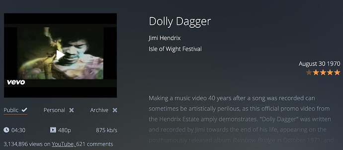
The default still from YouTube has a lot of black space and a bright white logo, not ideal:
It also doesn’t have an animated preview, like some of the other clips do – if you roll over the still, there is no movement.
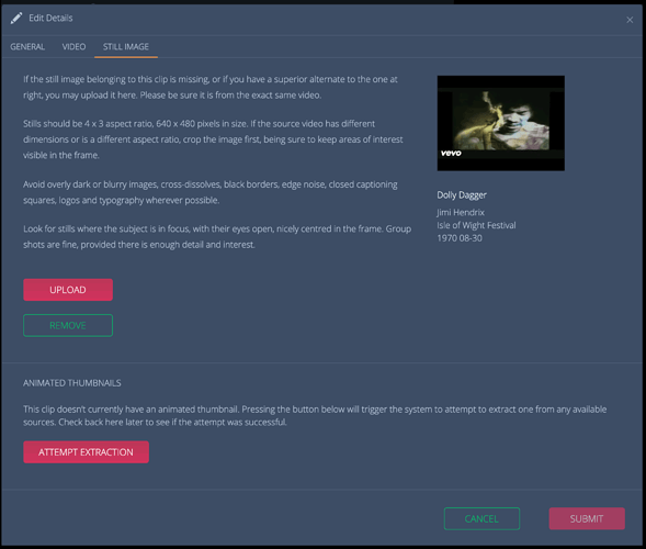
In the Images tab of the Edit Clip modal, we have a few options. If you have access to a copy of the video yourself and want to export a still of your choosing, you can upload it here, as described below:
You can also try and extract a short animated preview from the video, as described in the lower section of the modal window. That will also give us a chance to select a better still.
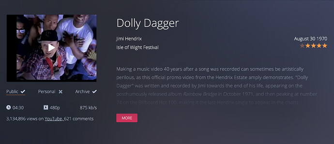
Checking the page a few minutes after pressing the button above, we see that the extraction was successful and there is an animated preview of the clip when we mouse over the still, which has also changed, as has the blurred background image, which has inherited the same purplish tone as the still:
This is something of an improvement visually, and the hazy purple is an appropriate touch, but we can do better.
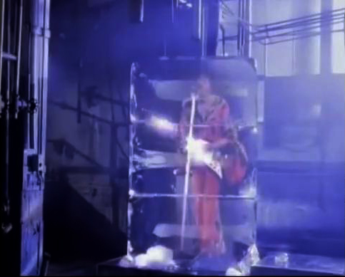
If you read the earlier post or if you’ve watched the video, you know this clip is a mix of historical performance footage and somewhat cheesy modern day art directed sequences that are at times fantastical – i.e. Jimi himself cryogenically reborn in the promo’s closing moments, bursting forth from some sort of ice block time machine:
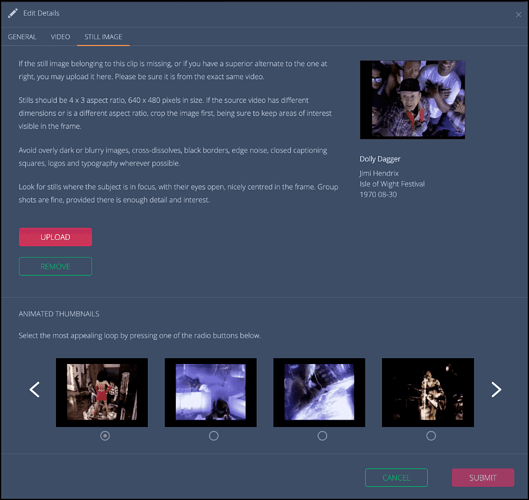
So we’ll need to be judicious when reviewing our options, which we can do back on the Still Image modal, that has now been updated:
Down at the bottom, we can choose a different bit of the video to serve as the animated preview. The first one is always selected by default, but in this case the second and fourth options show a bit of the real Hendrix, and have more variety, so either are better choices.
The option to select a different still is being added, watch this space.

